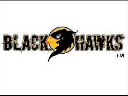
DC released the cover logos for the "New 52" last night, including the logos for the two new War titles, Blackhawks and Men Of War.
Not sure which one I like better. From what I gather, Men Of War is going to be more of a Modern Military book, while Blackhawks is going for more of a Military Fantasy title. So the logos seem appropriate to their genres.
The Men Of War logo looks like something from a ModMil video game. And considering the incredible success (*waves to Mr. Bones*) of those games, I consider this to be a Good Thing. Hopefully this is the sort of book which can attract the attention of that market, because that would help the book achieve some sales and notoriety. Blackhawks looks a little more traditional, but I still dig it. The bird head is a classic element and the stencil-style font works well too. I think that this title is poised to get some of IDW's GI Joe readers, and like the GI Joe logo this one is striking but not ostentatious.
You can see all 52 of the covers over at Newsarama, including the logo for The Savage Hawkman, which you can see at Being Carter Hall.
Subscribe to:
Post Comments (Atom)


No comments:
Post a Comment